If you read my 2014 New Year’s resolutions post, then you know that one of my main goals is to declutter and stay organized this year. This applies to all aspects of my life, including my work life. With that said, I’m going to be organizing and decorating both my cube at work and my home office (I work from home on Fridays) – and I’ll be sharing tips and products along the way.
First up is a great company that I recently discovered, See Jane Work, which is all about office style and organization. My favorite thing about See Jane Work is that they offer lots of fun, yet practical office products, all of which will make you a little bit happier about being stuck behind your computer for the work day. The founder and creative director, Holly Weiss, also offers tips on how to organize in style, which are super helpful.
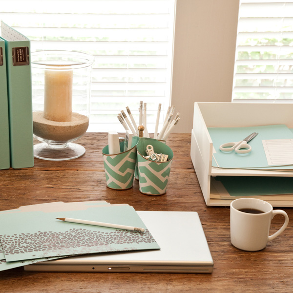
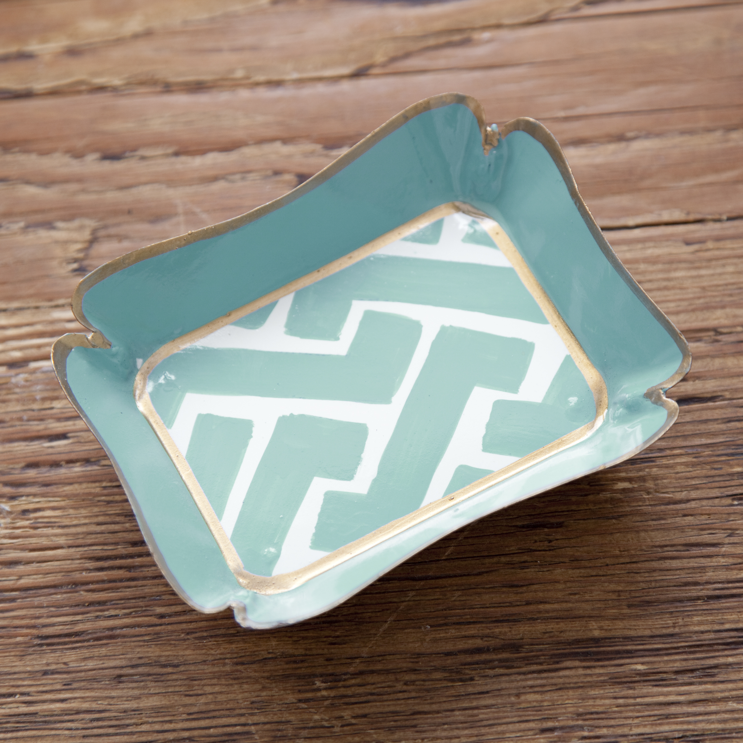
Holly offers great advice on how to choose an office color scheme, so that’s where I decided to start out. I decided to go with blues, pinks/corals, white and gold for my color scheme, and I’m starting it off with See Jane Work’s Hand-Painted Desk Caddy ($30) and matching Desk Tray ($20). The Desk Caddy has three connected compartments that are perfect for storing desktop tools and writing implements, and the Desk Tray is great for displaying your business cards, collecting other’s business cards or storing miscellaneous items that you use frequently, such as lip glosses and hand lotion.

Read on below for more on how to pick out your office color scheme and enter the Desk Caddy & Tray giveaway!
Choosing an Office Color Scheme
Holly has some great tips on how to choose an office color scheme, which is an important when considering the type of work environment you want to create for yourself. Here are her basic guidelines:
First, consider your objectives for the space and the effect your office color will have on coworkers and clients. For example, researchers found that red caused people to work faster. If that’s the case then shouldn’t everyone paint their office red? Definitely not, those same workers had more errors and higher heart rates. A red office would not be the best choice for a CPA.
Once you’ve figured out your objectives you need to decide on a color or colors. This should go without saying, but I’m going to say it anyway – test a color before you commit. Whether it’s a storage box or a paint color, live with it for a few weeks before you make a final decision. Also consider color combinations for balance and experiment with different color tones to achieve the desired effect.
![]()
Pink has a relaxing effect which is surprising considering it’s just a lighter shade of red. Nonetheless it can help with anxiety or aggressive behavior. It also looks great with green so if you’re feeling a little uptight, a green and pink color scheme could do wonders for you.
![]()
Blue has a calming effect. It can slightly lower blood pressure, heart rate and respiration. For balance and style combine blue with orange. Some shades of blue like turquoise are said to promote communication.
![]()
Green is soothing and relaxing so if you’re prone to anxiety at work, a predominately green office could be helpful. (It does curb the appetite, so if your office is a restaurant, green isn’t the color for you.)
![]()
Yellow is considered a memorable color. Is this why basic sticky notes come in yellow? Yellow is also a good color for concentration and self-esteem, perfect for a study area. When choosing a shade of yellow try to avoid the school bus look by selecting muted shades or simply balance with grey.
![]()
Red, like Orange and Yellow, has a stimulating effect. Studies have proven high cortical arousal in red rooms. It increases the heart rate and blood pressure, not a good choice if you suffer from high blood pressure. The color red is also associated with vitality, energy and ambition.
![]()
Violet or purple is considered to be the most versatile color. It promotes peace, wisdom, intuition and artistry. (I hope they have plans to paint all the walls in Washington D.C. violet!) Some say it can even help with headaches. No scientific tests have confirmed this, but if you suffer from headaches at work it’s worth trying.
![]()
Black is associated with strength and confidence. That’s why your black suit makes you feel powerful.
![]()
Orange is stimulating and can reduce fatigue. It has a warming effect that can work wonders in a room that is perpetually cold. It can also stimulate your appetite so I’ll be avoiding orange walls in my office.
![]()
White is a combination of all colors so while an all white room can be sterile, it can soften and illuminate other colors in the spectrum. If you have floor to ceiling windows in your office (I’m jealous) white walls can balance the colors coming in from the outdoors.
Choosing colors is still more of an art than a science. Studies seem conflicting and the results are complicated. In one study participants heart rates were lower in a multi-colored room than they were in a grey room. This seems to conflict with the evidence that red increases heart rates, but could provide scientific evidence that Jonathan Adler is on to something. The good thing is that color is easy to change. If you invest in neutral basics and accessorize with color you can make adjustments till you find the color scheme that’s right for you.
Now through Monday, March 3, 2014, you can enter to win your own Hand-Painted Desk Caddy & Tray. Enter below!
**While I was not compensated for this post, See Jane Work provided me with samples for review and to give away. The tips on choosing an office color scheme were written by See Jane Work’s founder, Holly Bohn Weiss. All opinions are my own.
my fav color is definitely blue! So relaxing